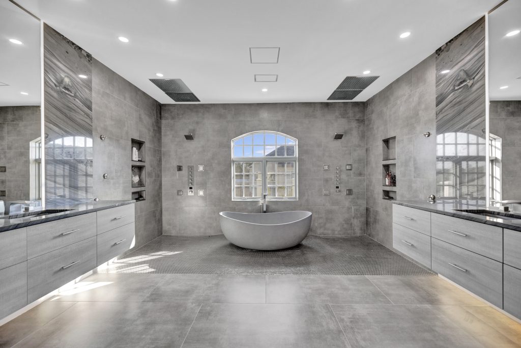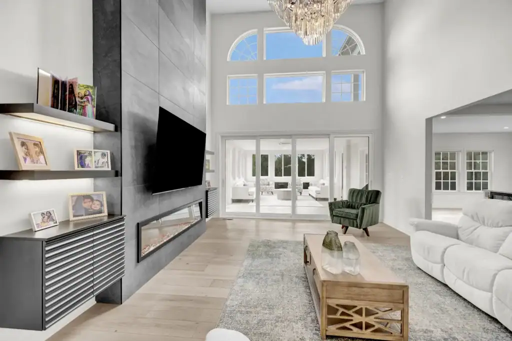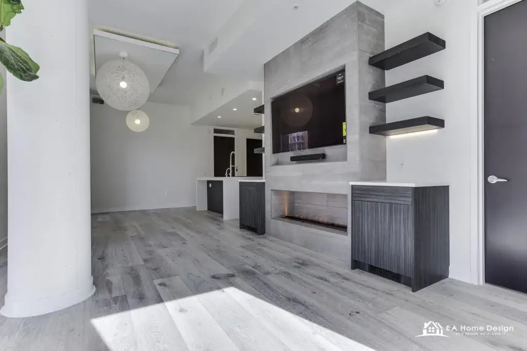
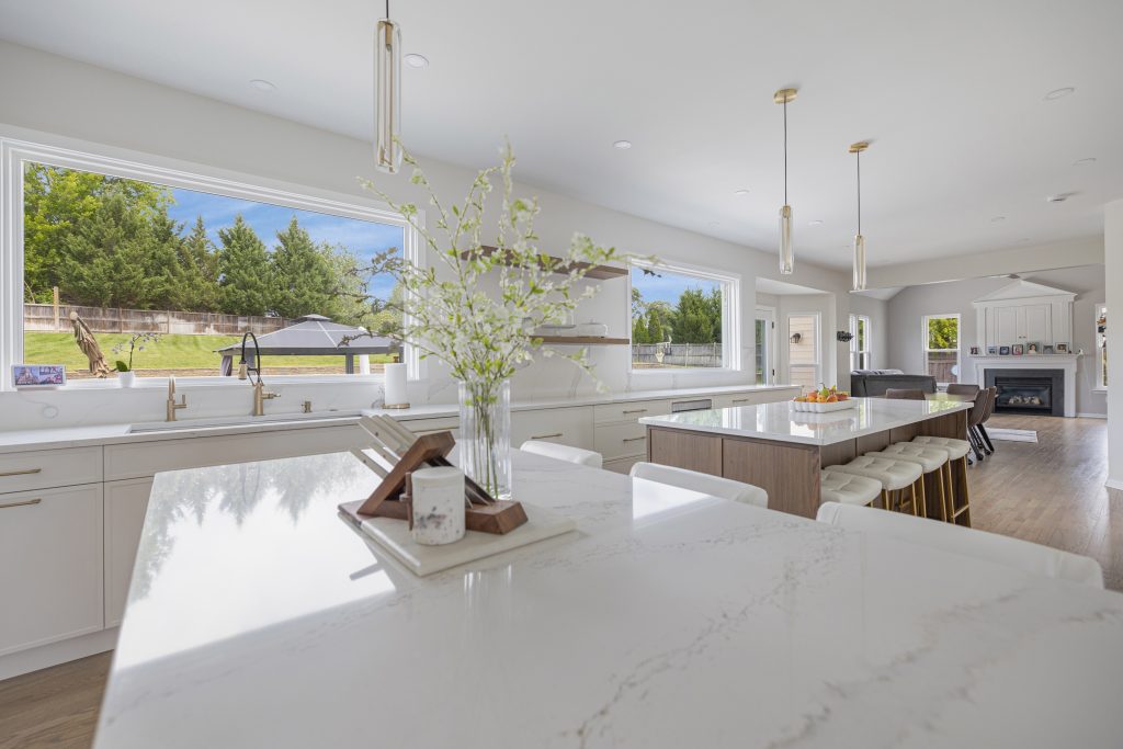
Room color psychology is the study of how the colors on your walls, cabinets, tile and furniture change the way a room feels and the way you behave in it. Blue slows a bedroom down, red wakes a dining room up, a warm white makes a north facing living room feel ten degrees friendlier in January, and a dark green study makes a long evening of work feel like a choice rather than a sentence. None of it is magic, and some of what gets written about it is nonsense, but the effects are real enough that we weigh them on every project at EA Home Design. This guide goes color by color through what each one tends to do and what choosing it says about you, then room by room, then through the rules that make color work in a real house with real light, with a section on color psychology in home remodeling for the decisions that are expensive to undo, the 2026 palette Northern Virginia homeowners are choosing, and what painting actually costs here now.
What Room Color Psychology Is, and What the Research Actually Says
Color psychology sits somewhere between science and folklore, and it helps to know which parts are which. The reliable findings are about lightness and saturation more than about hue. Light colors make a room feel larger and airier; dark colors make it feel smaller, closer and cozier. Strong, saturated colors raise energy and attention; soft, grayed colors lower them. Warm colors, the reds, oranges and yellows, make people report feeling warmer in a room, and cool colors do the reverse, which is why the same thermostat setting feels different in a terracotta kitchen and a pale blue bathroom. Those three effects hold across most people and most cultures.
The meanings attached to particular hues are softer. Blue reads as calm and green as restful for most people in most places, because sky, water and foliage are universal. Red reads as energy and appetite. Beyond that, associations are learned: a color that means mourning in one country means weddings in another, and the shade your grandmother painted her kitchen will always mean her kitchen to you. The honest summary is this: choose the lightness and intensity of a color for the effect you want, choose the hue for the mood and the associations you want to live with, and expect the room, the light and the furniture to matter as much as the color chart.
Room Color Meanings at a Glance
| Color | What it tends to do | What choosing it says | Best rooms | Use with care in |
|---|---|---|---|---|
| Blue | Calms, cools, slows the pulse, makes a room feel larger | Order, loyalty, a love of quiet | Bedrooms, bathrooms, home offices | Kitchens and dining rooms, where cool blue dulls food; north facing rooms |
| Green | Rests the eye, balances warm and cool, brings the outdoors in | Balance, nature, patience | Any room; living rooms, kitchens, studies, bathrooms | Very yellow greens in bedrooms, which read as nervous |
| Yellow | Cheers, brightens, raises energy | Optimism, sociability | Kitchens, breakfast nooks, mudrooms, dark halls | Bedrooms and nurseries, and anywhere in large, bright doses |
| Red | Energizes, warms, stimulates appetite and conversation | Confidence, appetite for life | Dining rooms, a powder room, an accent wall | Bedrooms, offices, and whole rooms of it |
| Orange and terracotta | Warms, welcomes, encourages activity | Enthusiasm, hospitality | Family rooms, kitchens as an accent, exercise rooms | Small rooms in full strength; use the clay and rust versions |
| Pink | Softens, soothes, warms skin tones | Warmth, playfulness, kindness | Bedrooms, nurseries, a plaster pink living room | Bright pinks in shared rooms; keep to dusty and earthy versions |
| Purple | Deep shades read rich and creative; lavender reads restful | Imagination, a taste for luxury | A study, a dining room, a bedroom in lavender | Bright purple anywhere large |
| Brown and earth tones | Grounds, warms, steadies | Stability, comfort, a love of the natural | Living rooms, dens, libraries, dining rooms | Dark brown in small, dim rooms |
| Gray | Recedes, quiets, flatters other colors | Restraint, sophistication | Living rooms, bathrooms, offices | Cool grays in north facing rooms, which turn cold and blue |
| White | Opens, lightens, cleans | Clarity, a preference for simplicity | Kitchens, bathrooms, small rooms, ceilings | Stark white in large living rooms, which reads as unfinished |
| Black | Adds depth, drama and focus | Confidence, a sense of theater | A powder room, a study, trim, window frames, an island | Whole bedrooms and anywhere with one small window |
| Beige, cream and greige | Warms without color, unifies | Ease, flexibility, a long view | Whole house palettes, open plans, hallways | Nowhere, if the undertone matches the fixed finishes |
The rest of this guide takes each of these in turn, then puts them in rooms. If you are choosing colors for a remodel rather than a repaint, the remodeling section below is the one to read first, because the color decisions that cost the most are the ones that are not paint.
Blue: The Color of Calm
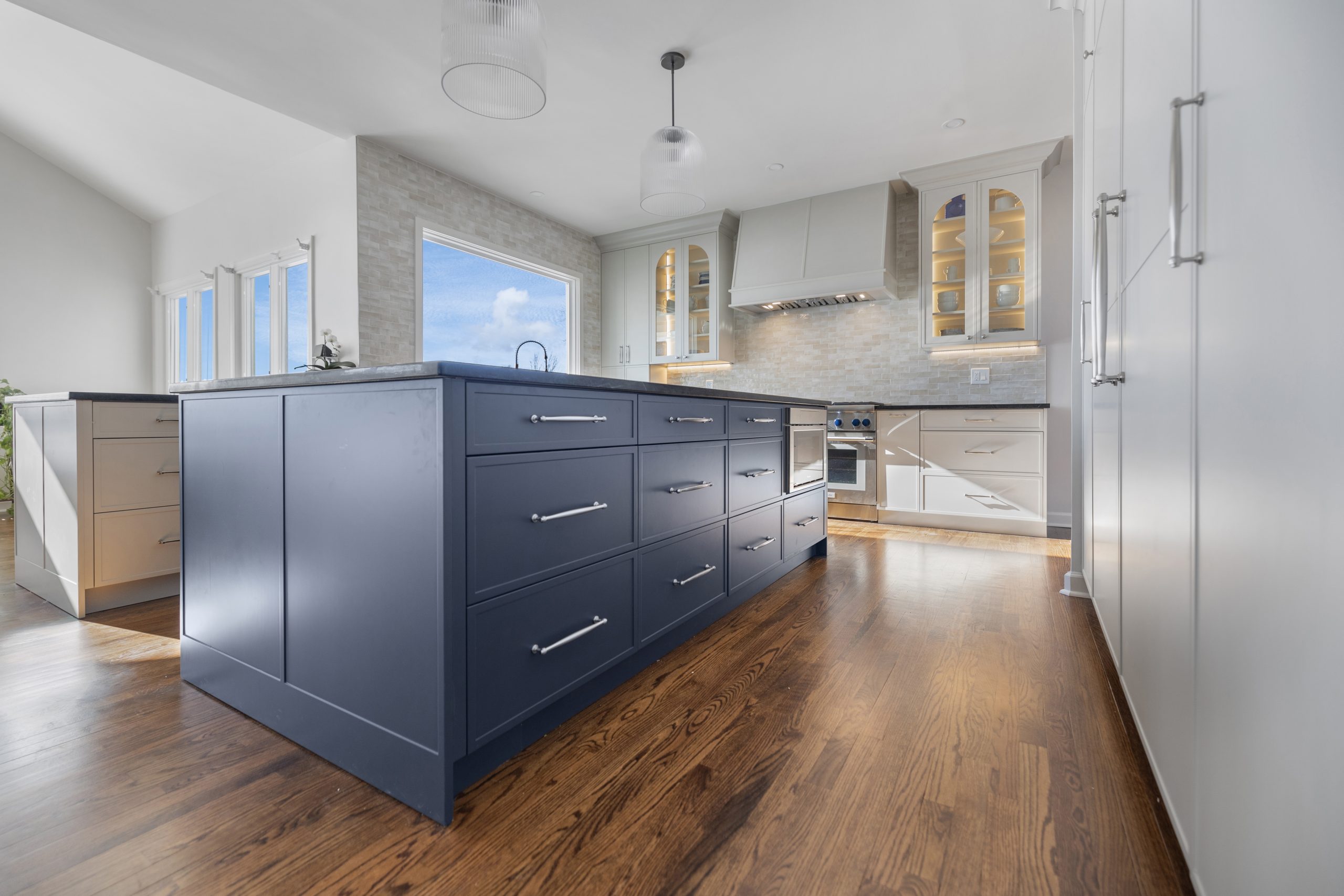
Blue is the most universally calming color on the chart and the one most bedrooms end up in for a reason. It lowers the apparent temperature of a room, pushes the walls back so the space feels larger, and reads as orderly and quiet. Pale blues and blue grays do this gently; navy and inky blue do it with drama, and on a vanity, an island or a study wall they read as formal and expensive rather than cold.
What choosing blue says about you: you like order, you like quiet, and you would rather a room settled you than stirred you. The pitfalls are real, though. Blue dulls the color of food, which is why blue kitchens and dining rooms are rarer than blue bathrooms, and in a north facing room with cool daylight a cool blue goes gray and chilly for half the year. In Northern Virginia, where winter light is low and gray from November to March, pick a blue with a touch of green or warmth in it, or use the deep version on one piece of cabinetry against warm white walls.
Green: The Color That Rests the Eye
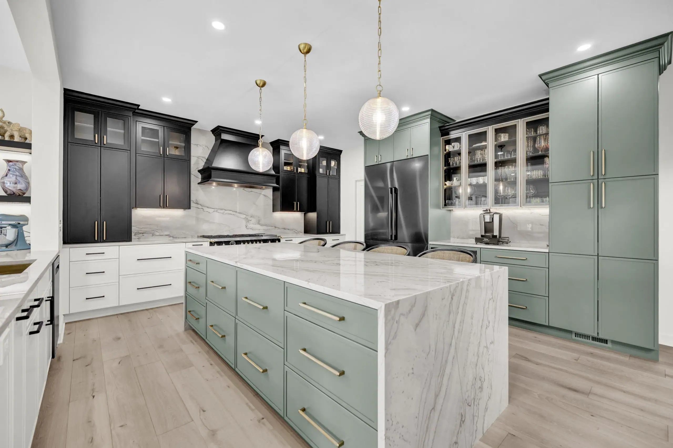
Green is the easiest color for human eyes to look at for long periods, which is why it is the most forgiving color on the chart and the one most likely to work in any room. It sits exactly between warm and cool, so it pairs with wood, brass, black, white and almost any other color, and it carries the association with gardens and foliage that the whole natural elements approach to interiors is built on. Sage and olive are the greens of 2026 in Northern Virginia kitchens and bathrooms, on cabinetry more than on walls; deep forest green is the color of the moody study and the dining room; mint and seafoam belong in a bathroom.
What choosing green says about you: you like balance and you like the outdoors, and you want the house to feel settled rather than styled. The only green to be careful with is the yellow green of lime and chartreuse in a bedroom, which reads as restless.
Yellow: Cheer in the Right Dose
Yellow is sunshine, and in small or dim rooms a soft butter or straw yellow does what a window cannot: it brightens a mudroom, a breakfast nook, a laundry room or a dark hallway and makes people cheerful on the way through. It stimulates conversation and appetite, so it has a long history in kitchens. The dose matters more than with any other color. Strong, saturated yellow on every wall of a bright room is tiring within an hour, and the old advice against yellow nurseries is sound: it is an energizing color, not a settling one.
What choosing yellow says about you: you are an optimist, you like company, and you probably cook. Use it on one wall, in a small room, or in its creamy and ochre versions on a larger one.
Red: Energy, Appetite and Warmth
Red raises the pulse, the appetite and the volume of conversation, and it makes a room feel physically warmer. That makes it the classic dining room color and a strong choice for a powder room, where a visitor spends two minutes and remembers it, or for a single accent wall behind a bar or a bookcase. It is the wrong color for a bedroom, where it fights sleep, and for an office, where it fights concentration. Oxblood, brick, cranberry and burgundy are the reds that work at scale in 2026; fire engine red belongs on a door.
What choosing red says about you: you are confident, social and unafraid of being noticed, and you probably host. Keep it to the rooms where that is the point.
Orange, Terracotta and Clay
Pure orange is a hard color to live in, but its earthy relatives, terracotta, clay, rust and burnt sienna, are among the most welcoming colors a home can carry and are the warm accents of the moment. They flatter skin, they glow in evening light, and they bring the warmth of red without its aggression. A terracotta tile floor, a clay colored powder room, a rust velvet chair in a cream living room, or an exercise room painted a brighter orange to keep energy up: those are the places it belongs.
What choosing orange says about you: you are enthusiastic and hospitable, and your house is the one people gather in. Full strength orange in a small room is the one version to avoid.
Pink: Softer Than Its Reputation
Pink has outgrown the nursery. Dusty rose, plaster pink and the pinkish beiges that sit between pink and tan are warm, soothing, flattering colors that make a living room or bedroom feel gentle without reading as sweet. Pink warms every skin tone in the room, which is why it has become a favorite for bathrooms and dressing rooms. Bright and bubblegum pinks are the exception; they belong to a child who asked for them.
What choosing pink says about you: you are warm, playful and kind, and you care more about how a room feels than how it photographs.
Purple: Luxury at the Dark End, Rest at the Light End
Purple splits into two colors. At the dark end, eggplant, plum and aubergine read as rich, creative and theatrical, and they make a dining room or a study feel like a private club. At the light end, lavender and lilac behave like blue: restful, cool and quiet, without blue’s tendency to feel cold. Mid strength purples are the hard ones; a bright violet wall ages a room faster than any other choice on this page.
What choosing purple says about you: you are imaginative, you like a little luxury, and you are not following anyone else’s chart.
Brown, Tan and the Earth Tones
Brown is less a paint color than a material color: it arrives in a house as wood floors, walnut cabinetry, leather, jute and the stone of a fireplace, and it grounds everything around it. On walls, the earth tones, camel, taupe, mushroom, mocha and the warm tans, are the colors that make a living room feel like somewhere to stay. They have replaced cool gray as the neutral of choice in Northern Virginia homes, and the deeper browns are back on cabinetry and in dining rooms after twenty years away.
What choosing brown says about you: you value comfort and stability, you like real materials, and you would rather a room aged well than photographed well. Keep the darkest browns out of small, dim rooms, where they close in.
Gray: The Neutral That Needs the Right Light
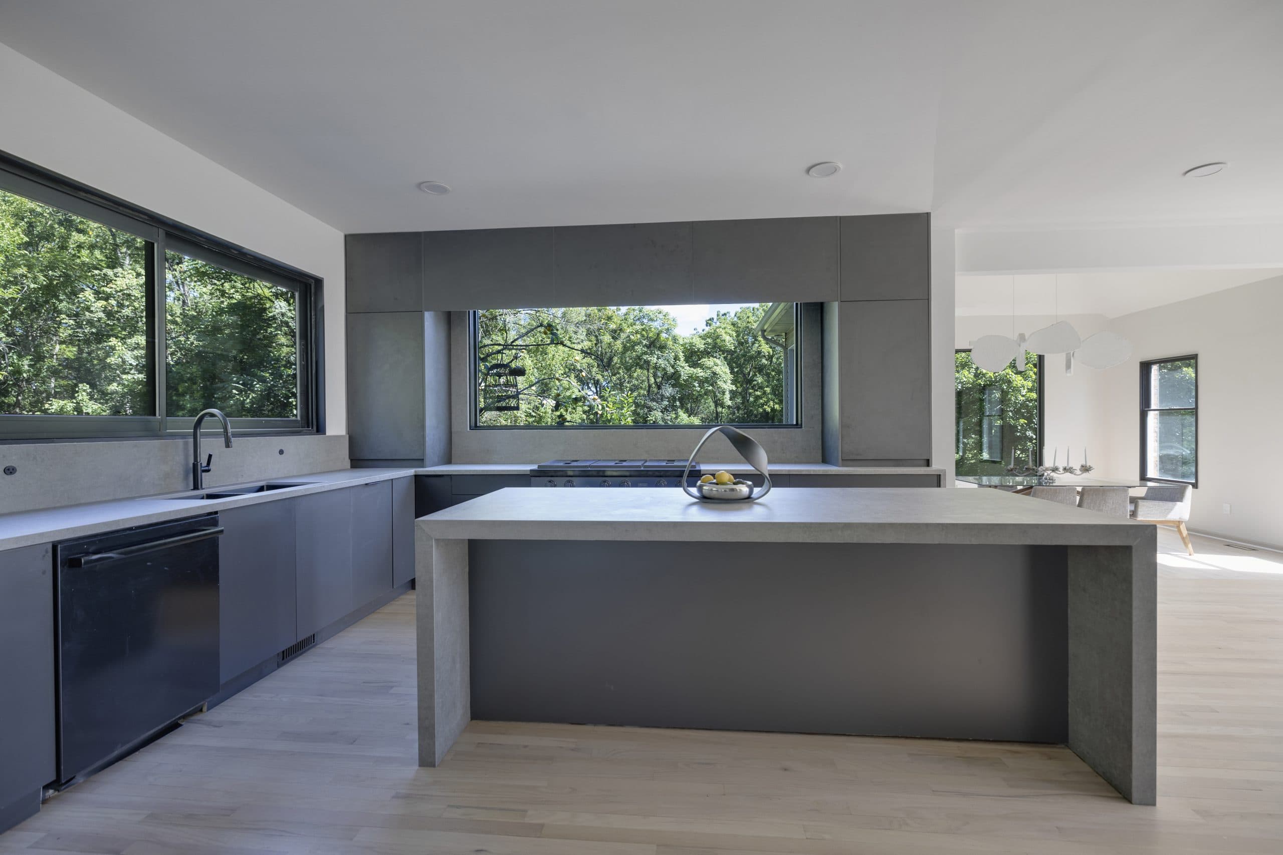
Gray quiets a room and makes every other color in it look more considered, which is why a decade of interiors ran on it. Its weakness is light. A cool gray in a north facing room, or in any Northern Virginia room in February, turns blue and cold, and the room feels like a waiting area. The fix is undertone: the warm grays, greige and the grays with a drop of green or brown in them, hold their color through the winter. Charcoal on a feature wall, a vanity or an island gives the depth of black without its weight.
What choosing gray says about you: you are restrained, you like sophistication over spectacle, and you plan to change the pillows rather than the walls. Choose the undertone in the room, in January if you can.
White: Light, Air and the Risk of Nothing
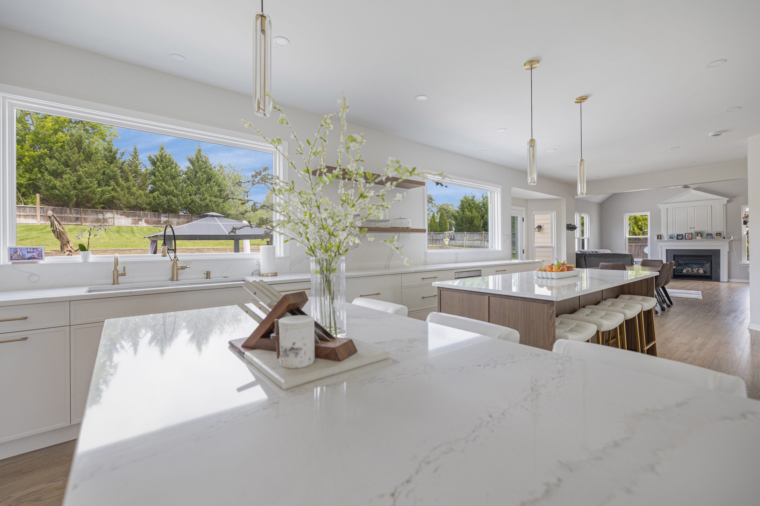
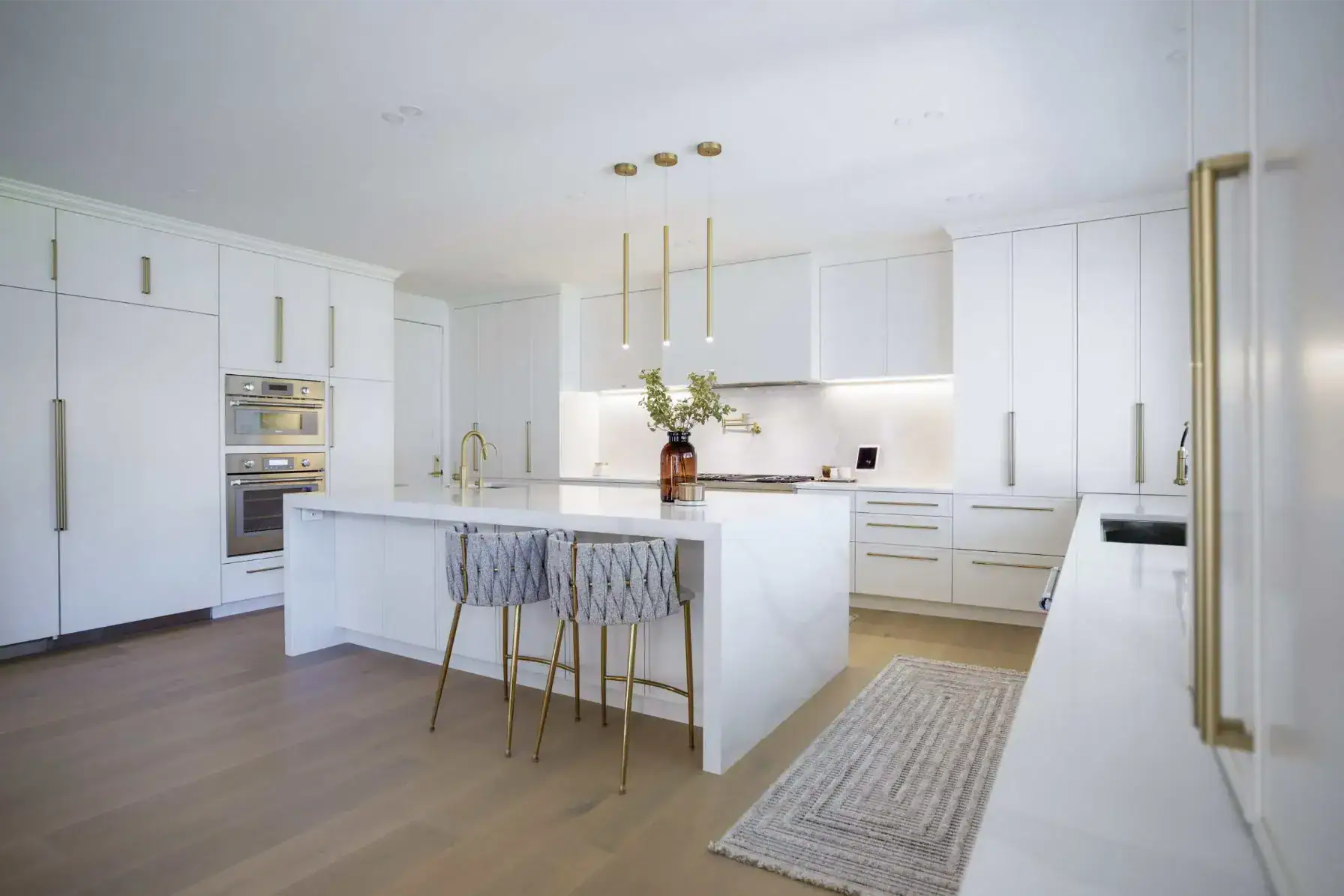
White makes a room feel bigger, brighter and cleaner, bounces daylight into corners, and is the default for kitchens, bathrooms, ceilings and small rooms for all of those reasons. It has a hundred versions, and that is where it goes wrong. A stark, blue white in a large living room reads as unfinished; a warm white, with a touch of cream, yellow or red in it, reads as calm. In 2026 the warm whites have won, and the right white is chosen against the counter, the tile and the floor it will sit beside.
What choosing white says about you: you like clarity and simplicity, you want the furniture and the view to carry the room, and you will keep it clean. The timeless bathroom guide covers the white and off white schemes that stay current longest.
Black: Depth in Small Doses
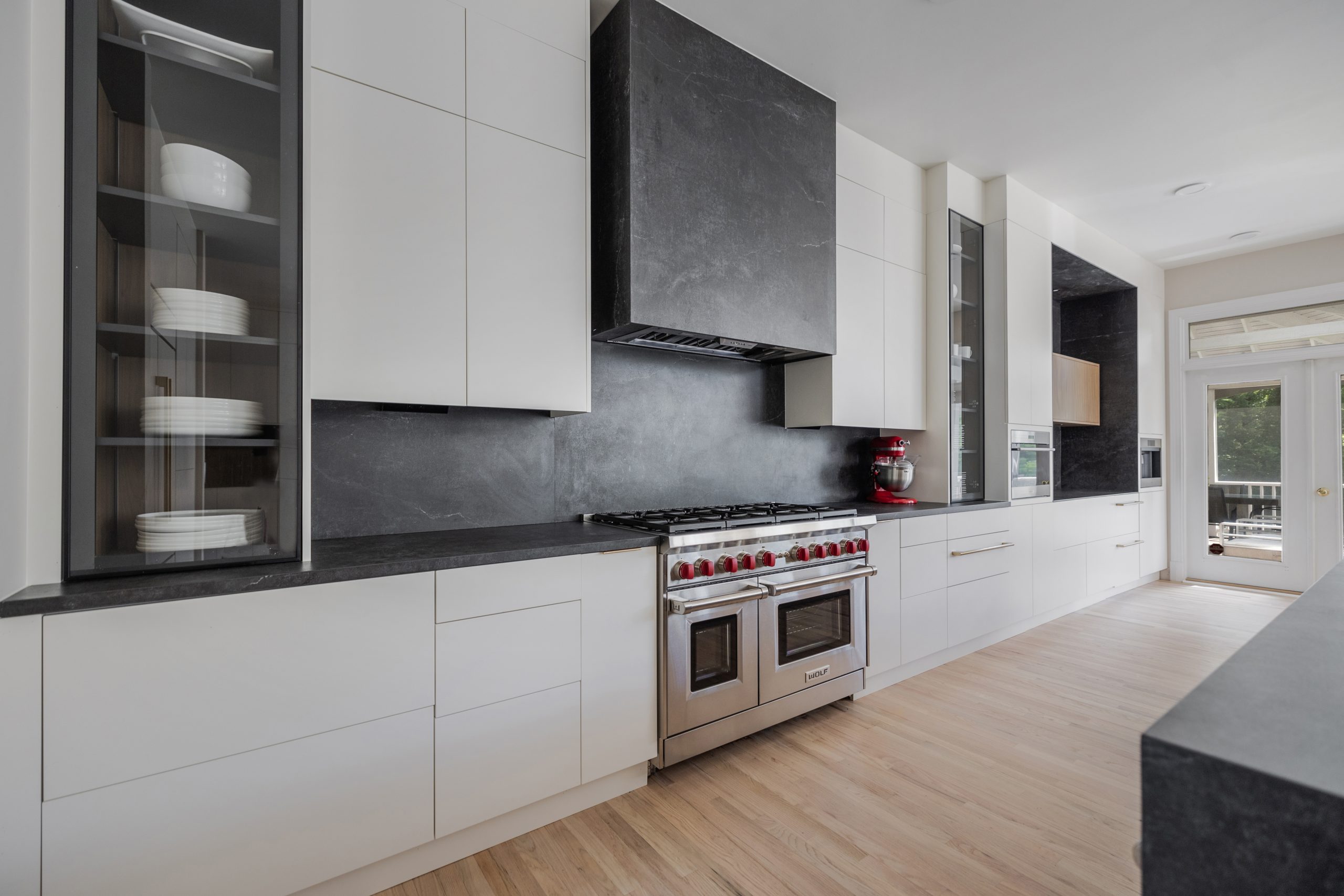
Black is the color that gives a room its edges. As a line, on window frames, a faucet, a light fixture, a stair rail or the hardware across a run of cabinets, it sharpens everything around it. As a surface, on an island, a vanity, the walls of a powder room or a study, it adds drama and depth and makes a small room feel deliberate rather than small. As a whole bedroom with one window it is a cave. The 2026 version is soft black, nearly charcoal, in a matte finish, paired with warm wood and brass; our mixing metals guide covers that pairing.
What choosing black says about you: you are confident, you like a sense of theater, and you know exactly where the light comes from.
Beige, Cream and Greige: The Quiet Majority
The warm neutrals are the colors most of a house ends up in, and the choice among them is the most consequential paint decision in a remodel because it touches every room. Cream leans yellow and warms a dark house; greige sits between gray and beige and suits a modern plan; taupe and mushroom carry a little brown and pair with oak and stone. The undertone has to match the fixed finishes, the floor, the counter and the tile, or the walls will look faintly dirty against them for as long as they last.
What choosing a warm neutral says about you: you like ease and flexibility, you plan to live with the room for a long time, and you want the color to come from the people, the art and the view. The 2026 design trends guide tracks which of these neutrals Northern Virginia homeowners are choosing now.
What Your Room Colors Say About You
Treat this as tendencies rather than a test. The color a person reaches for again and again, the one that shows up in three rooms, a car and a coat, tells you something about what they want a space to do for them. Someone who paints every room a different strong color wants stimulation and variety. Someone whose whole house runs on warm neutrals and one navy island wants calm with a single point of confidence. A house where the public rooms are bold and the bedrooms are pale belongs to someone who performs by day and recovers at night, which is most of us.
| If your house leans toward | It usually says | The room that proves it |
|---|---|---|
| Blues and blue grays throughout | You want the house to lower your heart rate | A pale blue primary bedroom with white trim |
| Greens on cabinets and in the living room | You want the outdoors indoors and a room that does not date | A sage kitchen with oak floors and a window over the sink |
| Warm neutrals with one dark accent | You want calm with a single deliberate statement | Cream walls and a black or navy island |
| Reds, terracottas and deep warm colors | You host, you cook, you want people to stay late | A burgundy dining room or a clay powder room |
| Whites and pale grays everywhere | You want light and simplicity and you will keep it edited | An all white kitchen with marble and brass |
| Dark, moody colors in the small rooms | You like drama where it can be enjoyed in short doses | A black powder room or a forest green study |
| A different color in every room | You like variety and you think of rooms as separate worlds | A yellow mudroom beside a navy office |
Room by Room: Which Colors Work Where
A color that is right for a dining room is wrong for a bedroom, and the reason is always the same question: what should the room do to the people in it?
Bedroom
The bedroom should slow you down. Pale blue, blue gray, sage, lavender, soft pink and the warm whites all do that; red, bright yellow and saturated orange do the opposite, and a strong color behind the bed works only if the rest of the room is quiet. Dark bedrooms, in navy, charcoal or forest green, are restful for people who sleep best in a cave and oppressive for people who do not, so decide which you are before you commit. An accent wall behind the headboard is the way to bring a strong color into a bedroom without surrounding yourself with it.
Living Room
The living room has to work at noon and at midnight, for a party and for one person with a book, so it takes the most forgiving colors: warm neutrals, greige, soft greens, warm grays and the earth tones. Strong color comes in through furniture, art, a rug and one wall if the room is large. A north facing living room, common in the colonials of Fairfax and Loudoun County, needs warmth in the wall color to survive the winter light; a south facing one can take a cooler gray or a true white.

Kitchen
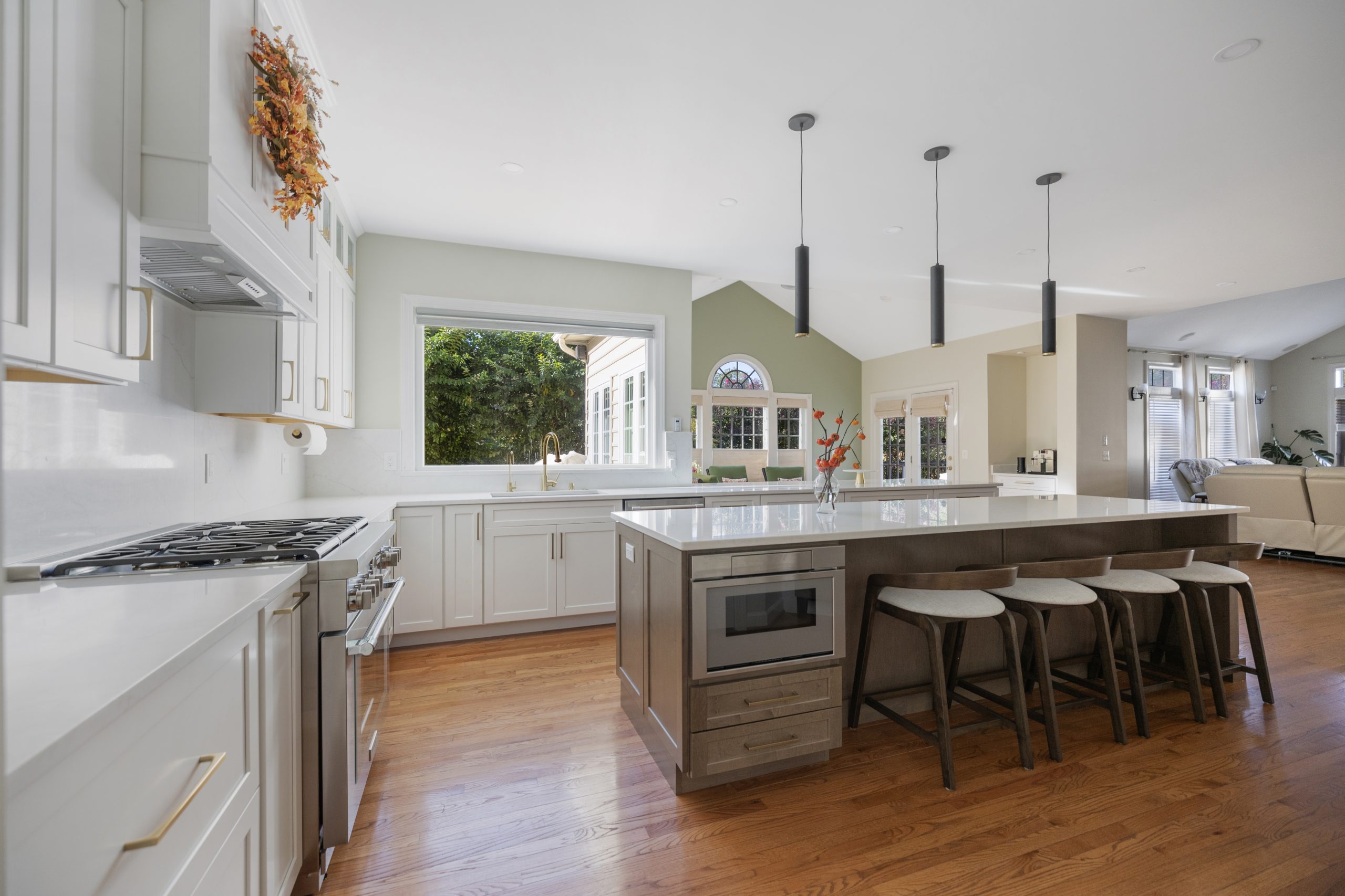
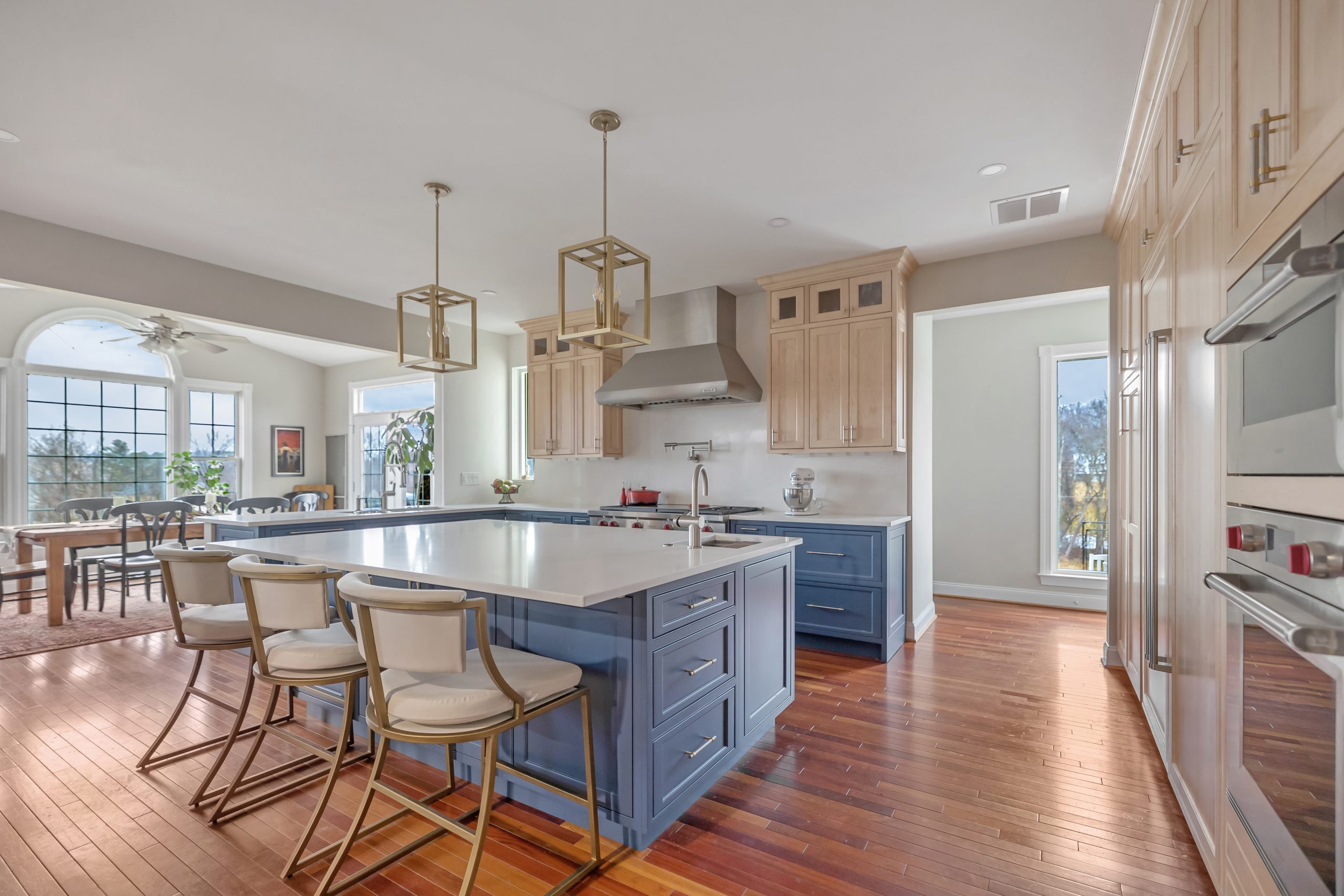
Kitchens live on their cabinet color more than their wall color, and the cabinet decision is a remodeling decision, which is why it has its own section below. The psychology still applies: warm whites, creams, sage, olive and navy make people linger; cool blue and strong gray flatten the food and the faces around the island. A two tone kitchen, with darker lowers or a dark island under pale uppers, grounds the room and keeps the color where the hands and the eye land. Our kitchen cabinet ideas guide shows the colors in finished Northern Virginia kitchens, and our kitchen wallpaper guide covers color by the roll for owners who want it on one wall.
Dining Room
The dining room is where the warm, deep and dramatic colors belong, because people sit in it for two hours at a time, in the evening, with candles. Burgundy, terracotta, plum, forest green and deep brown make a dinner feel like an occasion; a dark ceiling in the same color makes it feel like a room in a restaurant. It is also the room where blue least belongs.
Bathroom
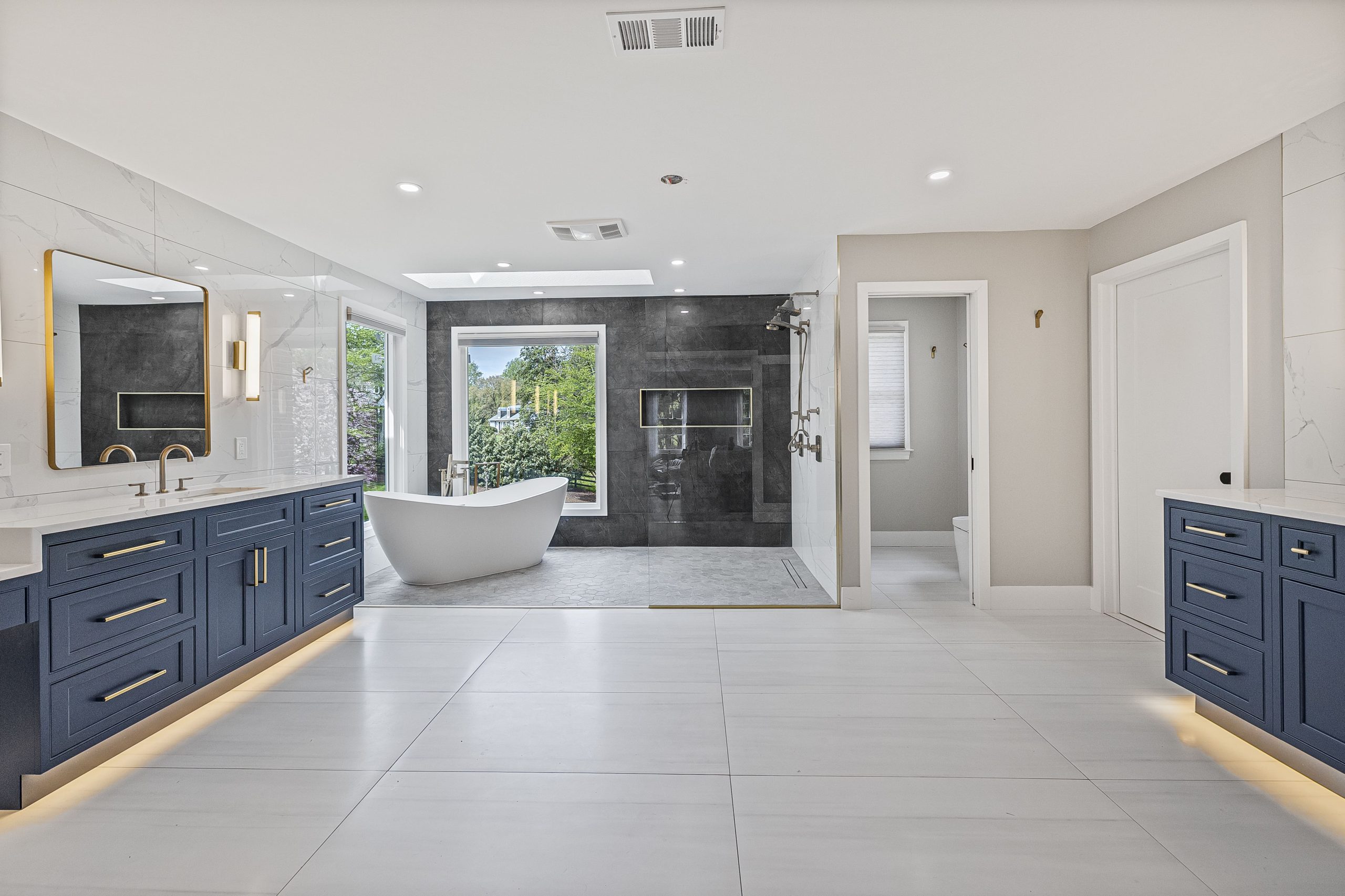
Bathrooms take the cool and clean colors well: white, pale blue, seafoam, sage, soft gray, and the spa palette of warm white and stone. The strong colors go in the powder room, which is small enough and visited briefly enough to be any color at all, and black, navy and deep green powder rooms are among the most photographed rooms of the past three years. A colored vanity, in navy, sage or black, is the bathroom’s version of the kitchen island: one piece of color in a calm room. Our luxury bathroom ideas guide shows the colors that read as expensive on a budget.
Home Office
An office needs focus without fatigue. Green is the research favorite because it rests the eye between stretches of screen work; blue gray, soft gray and warm white are the safe choices; deep green and navy work for people who like a cocoon. Red and bright yellow are the colors to keep out, and a strong color on the wall behind the monitor is a mistake on video calls. Our home office guide covers the layout and the lighting that go with it.
Children’s Rooms and Nurseries
Children’s rooms are where the old advice is most often ignored and most often regretted. A nursery wants the settling colors, soft green, pale blue, blush, warm white, not the primary colors of the toy aisle; the toys will bring those. A child old enough to choose should choose one wall, which can be repainted in a Saturday when the choice changes.
Basement, Media Room and Gym
A finished basement fights for light, so the main rooms want pale, warm colors with a high light reflectance, and a painted ceiling in the same color as the walls to blur the low height. The exceptions are deliberate: a media room in charcoal or deep navy so the screen is the brightest thing in it, and a gym in a brighter, warmer color to keep the energy up. Our finished basement ideas and media room guides go further on both.
Entry, Hall and Stairs
The entry sets the expectation for the house and it is usually the darkest room in it. A warm white or soft yellow lifts a windowless hall; a deep color in a hall with a window makes the rooms off it feel brighter by contrast. The hall and stair color should run unbroken through the house, because it is the color every other room is seen against. Our small hall ideas guide shows what works in the narrow colonial entries that most Northern Virginia houses have.
The Rules That Make Color Work in a Real Room
Light Comes First
Every color on a chip is a different color on a wall, and the difference is light. North facing rooms receive cool, blue, even light, and they push every color toward gray; they want warm undertones and lighter values. South facing rooms receive warm, strong light and can carry cooler and deeper colors. East rooms are warm in the morning and cool by afternoon, west rooms the reverse. In Northern Virginia the sun is low and the days are gray for a third of the year, so a color that looked right in a July showroom often needs a warmer cousin. Artificial light matters just as much: warm bulbs at 2700 kelvin push colors yellow, neutral bulbs at 3000 to 3500 kelvin show them closer to daylight, and the mix of both in one room is the most common reason a color looks wrong at night.
Undertones and Light Reflectance
Every neutral and most colors carry a second color underneath: a gray may lean blue, green or purple, a white may lean yellow or pink, a beige may lean orange. Put two together with different undertones and one of them will look dirty. Paint manufacturers publish a light reflectance value for every color, from 0 for black to 100 for pure white; colors above 60 bounce light and open a room, colors below 20 absorb it and close the room in. Choose the value for the size and light of the room, and the undertone to match the floor, the counter and the tile.
The 60 30 10 Rule
The oldest rule in decorating still works. Sixty percent of the room, usually the walls and the largest pieces, in the dominant color; thirty percent, the upholstery, rugs, cabinetry or a feature wall, in a second color; ten percent, the art, pillows, hardware and accessories, in the accent. A room that follows it looks composed; a room that splits evenly between two strong colors looks like an argument.
Sheen Is Part of the Color
The same color in flat, eggshell, satin and semi gloss is four different colors, because sheen reflects light and shows texture. Flat and matte hide wall flaws and give deep colors their velvet; eggshell is the living room and bedroom default; satin stands up in kitchens, bathrooms and hallways; semi gloss belongs on trim, doors and cabinets. Dark colors look richest in matte and cheapest in gloss.
Test Before You Commit
Paint two large samples, at least two feet square, on two different walls of the room, or use peel and stick samples the size of a sheet of paper, and look at them in the morning, at midday, in the evening and under the room’s own bulbs for three days. Hold the sample against the floor, the counter and the sofa, not against the old wall color, which will distort it. A color that passes that test will not surprise you; a color chosen from a chip in a store will.
Fixed Finishes First, Paint Last
This is the rule that separates a remodel that looks designed from one that looks assembled. The floor, the countertops, the tile, the cabinets and the stone are chosen first, because they are expensive, permanent and come in limited colors. The paint is chosen last, because it is cheap, temporary and comes in every color. Owners who paint first and shop second spend the rest of the project trying to find a tile that matches a wall, and it never quite does.
Color Psychology in Home Remodeling
Most of this guide is about paint, which costs a few hundred dollars and lasts until you change your mind. A remodel is different. Cabinets, tile, counters, flooring and fixtures are colors you will live with for fifteen or twenty years, and the psychology that is easy to get right on a wall becomes expensive to get wrong on a vanity. These are the principles we use on every kitchen and bathroom project in Fairfax and Loudoun County.
- Put the permanent color where the psychology is simplest. Cabinets, tile and counters should carry the settling colors: warm white, cream, sage, olive, navy, charcoal, wood and stone in their own colors. The stimulating colors, the reds, yellows and oranges, go on paint, textiles and accessories, where they can change.
- One strong color per room, on one piece. A navy island, a green vanity, a black range wall. Everything else in the room is quiet, and the piece becomes the thing people remember.
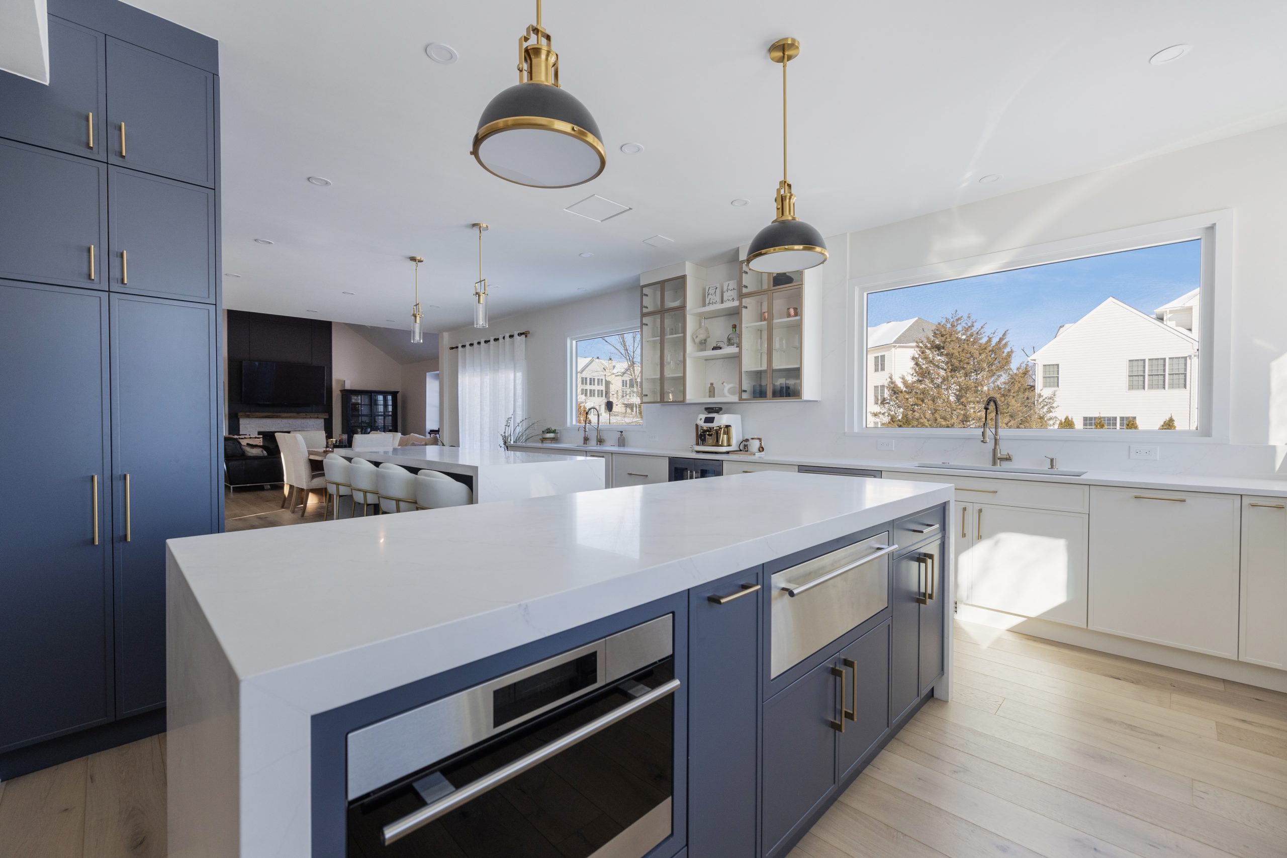
- Two tone kitchens work because of weight, not fashion. Darker lowers and a lighter run of uppers ground the room and lift the ceiling; the reverse makes a kitchen top heavy. The island can be the darkest thing in the room because it sits in the middle of it.
- Choose cabinet and tile colors in the room, in the light, against each other. A door sample, a tile sample and a counter sample on the floor of the actual kitchen for a week tells you more than a showroom ever will.
- Resale is a color question. Warm whites, creams, greige, sage and navy sell; strong personal colors on permanent surfaces cost buyers imagination and cost sellers offers. Our guide to remodels that pay off covers the rest of that decision.
- The bold rooms are the small rooms. A powder room, a laundry, a pantry, a mudroom, a bar: short visits, small surfaces, low cost to change. That is where the black walls, the clay tile and the patterned floor belong.
- Dark cabinets need light to land on. A navy or black kitchen works with a window wall, a pale floor, a light counter and under cabinet lighting; the same cabinets in a galley with one window are a tunnel.
- Warm metals warm a cool palette. Brass and bronze on gray, blue or white cabinetry do what a warm paint undertone does on a wall; polished chrome and nickel keep a cool palette cool.
The sequence matters as much as the choices. On an EA Home Design project the interior design work begins with the fixed finishes, the cabinet color, the counter, the tile and the floor, laid out together, and only then moves to paint. Owners who want help with that sequence and nothing else can get it from a consultation; our guide to whether an interior designer is worth the money explains when that is enough and when it is not.
The 2026 Palette in Northern Virginia Homes
The gray decade is over. The homes we are finishing in Fairfax, Loudoun and Arlington in 2026 run warm: creamy and warm whites on walls and ceilings, greige and mushroom in the open plans, sage and olive on kitchen cabinets and bathroom vanities, navy and inky blue on islands and in studies, clay and terracotta in tile and textiles, deep green and burgundy in dining rooms and powder rooms, and black used as a line in window frames, hardware and lighting. Plum and oxblood are arriving as accents. What has left: cool gray walls, stark white kitchens with gray floors, and the single accent wall in a color found nowhere else in the house. Our 2026 architecture and design trends guide covers the paint colors homeowners are choosing for bedrooms this year, and the Northern Virginia design trends guide tracks the whole palette.
| The mood you want | Walls | The one strong piece | Metal and wood |
|---|---|---|---|
| Calm and restful | Warm white or pale blue gray | A sage or navy vanity | Brushed brass, white oak |
| Warm and welcoming | Cream or soft greige | A clay colored powder room or a rust chair | Aged brass, walnut |
| Bright and energizing | Warm white | A butter yellow mudroom or a two tone kitchen with olive lowers | Black, pale oak |
| Focused and quiet | Soft gray green | A deep green study wall | Black, walnut |
| Dramatic and intimate | Charcoal or deep navy, walls and ceiling | The room itself | Brass, dark wood |
| Light and simple | Warm white throughout | A marble counter or a black window frame | Chrome or nickel, white oak |
What Painting and Color Work Cost in Northern Virginia (2026)
Color is the cheapest change in a house and the one most often done twice. These are the figures we use for Fairfax and Loudoun County in 2026, the same ones as our accent wall and cabinet guides. Professional figures include two coats of a quality paint, patching and protection; the do it yourself figures are materials only.
| Color work | Northern Virginia 2026 | Notes |
|---|---|---|
| One 12 by 9 foot accent wall, painted | $250 to $600 professionally; $50 to $120 yourself | From our accent wall guide; a deep color needs a tinted primer and an extra coat |
| One 12 by 12 bedroom, walls only | $600 to $1,400 professionally; $100 to $200 yourself | Ceilings add $200 to $450; trim and doors add $250 to $600 |
| Open plan living, dining and kitchen walls | $2,000 to $4,500 | Two story foyers and stairwells are the expensive square feet |
| Whole house interior, 2,500 square feet, walls, ceilings and trim | $6,000 to $14,000 | Empty houses cost less; occupied houses with furniture cost more |
| Kitchen cabinets, professionally sprayed, with new hardware | $3,000 to $8,000 | From our cabinet guides; the cheapest real color change in a kitchen |
| Bathroom vanity, painted or replaced in a color | $300 to $800 to paint; $1,500 to $5,000 for a new colored vanity installed | A navy, sage or black vanity is the bathroom’s one strong piece |
| Color consultation with a designer | $150 to $500 for one to two hours | Enough for a room of paint and furniture; a remodel needs the full design process |
| Peel and stick samples | $5 to $10 each | Twelve samples cost less than one wrong gallon |
A kitchen or bathroom whose colors arrive in tile, counters and cabinetry is priced as a remodel rather than as a sum of this table; our case studies show what those rooms cost in full.
Twelve Color Mistakes We See in Northern Virginia Homes
- Choosing a color from a chip under store lighting and painting the whole room before seeing it at home.
- A cool gray in a north facing room, which turns blue and cold from November to March.
- Stark, blue white in a large living room, which reads as unfinished rather than clean.
- Red or saturated yellow in a bedroom or a nursery.
- A different accent wall color in every room, so the house has no thread running through it.
- Painting first and buying the tile, counter and floor second.
- Undertones that fight: a pink beige wall against a yellow beige floor.
- Dark cabinets in a kitchen with one window and no under cabinet lighting.
- Gloss paint on a deep color, which turns velvet into plastic.
- Warm bulbs over a cool palette, or cool bulbs over a warm one.
- A strong personal color on a permanent surface in a house that will sell within five years.
- Treating a color chart as a personality test instead of as a set of tendencies to check against the light, the room and the people who live in it.
Frequently Asked Questions
What is room color psychology? The study of how colors on walls, cabinets, tile and furniture change the way a room feels and the way people behave in it. The reliable effects are about lightness and saturation: light colors open a room, dark colors enclose it, strong colors raise energy and soft colors lower it. Hue adds mood and association on top of that.
What does each room color mean? In broad strokes: blue calms, green rests and balances, yellow cheers, red energizes and warms, orange and terracotta welcome, pink softens, dark purple reads rich and lavender reads restful, brown grounds, gray quiets, white opens, black adds depth and drama, and the warm neutrals unify. The table near the top of this guide gives each one with its best rooms.
What does your room color say about you? Treat it as a tendency rather than a test. People who reach for blues want calm; greens, balance and the outdoors; warm neutrals with one dark accent, ease with a single point of confidence; reds and terracottas, company and warmth; whites and pale grays, light and simplicity; dark colors in small rooms, drama in short doses.
What is the most calming color for a bedroom? Pale blue, blue gray, sage green, lavender and the warm whites. Dark navy or forest green also rests people who sleep best in a cocoon. Red, bright yellow and saturated orange are the colors to keep out of a bedroom.
What color makes a room look bigger? Light colors with a high light reflectance value, above about 60: warm whites, pale neutrals, pale blues and soft greens, with the ceiling painted the same color or a lighter version of it. Low contrast between walls and trim also helps.
Which colors are best for a kitchen? Warm whites, creams, sage, olive and navy on cabinetry, with wood and stone in their own colors. Cool blue and strong gray dull food and faces. A two tone kitchen with darker lowers or a dark island under pale uppers is the most reliable way to bring a strong color in.
How do I choose colors for a remodel rather than a repaint? Choose the fixed finishes first, the floor, the counters, the tile and the cabinets, in the settling colors, and choose paint last. Put one strong color on one piece per room, keep the bold colors to small rooms and changeable surfaces, and sample cabinet doors, tile and counter together in the actual room for a week.
Why does my paint color look different at home than on the chip? Light. North facing rooms push colors gray and cold, south facing rooms warm them, and warm bulbs push everything yellow. Sheen changes it again. Paint two large samples on two walls and look at them morning, noon and night under the room’s own bulbs before committing.
What colors are trending in Northern Virginia homes in 2026? Warm whites and creams, greige and mushroom, sage and olive cabinetry, navy islands and vanities, clay and terracotta accents, deep green and burgundy in dining rooms and powder rooms, and black as a line in frames, hardware and lighting. Cool gray walls and stark white kitchens are leaving.
How much does it cost to paint a room in Northern Virginia? In 2026, a 12 by 12 bedroom runs $600 to $1,400 professionally for the walls, with ceilings and trim adding $450 to $1,050 more; an accent wall $250 to $600; a whole 2,500 square foot interior $6,000 to $14,000; cabinets professionally sprayed $3,000 to $8,000. A color consultation runs $150 to $500.
Choosing With the Room, Not the Chart
Room color psychology is a useful set of tendencies and a poor set of rules. Blue will calm most bedrooms and red will wake most dining rooms, a warm white will rescue most north facing living rooms in January, and a strong color on one piece will do more than the same color on four walls. Beyond that, the room decides: its light, its size, its floor and counters, and the people who will sit in it. Start with the two foot samples this weekend. When the colors arrive in cabinets, tile and stone rather than paint, EA Home Design chooses them in the room, in the light, against each other, and prices the room once. Our interior design team works across Fairfax, Loudoun, Arlington and the rest of Northern Virginia.